It's all about Little Black Graphite~Feel it.
Sunday, December 19, 2010
Thursday, December 9, 2010
INTD 101- Project #5 Final
Front View
View from the top
Back view
Side View
The theme of this kiosk is national gallery. We are trying to make the decoration simple and clean, so that the DC POSTCARDS will be the main attractive element. Within the kiosk, there is only one cash table which works as a storage for postcards, the rest of the space is for consumers to walk around and enjoy the postcards. Although this is not a great design but I think it works.
Sunday, December 5, 2010
INTD 101- Project #5 working in progress
Tuesday, November 30, 2010
INTD 101- Project #5 Logo
This is the logo we come up with.
The logo is the official one and it will appear on every postcard.
Tuesday, November 23, 2010
INTD 101- Project #5 Group Project
This project is a fun project. We need to design a kiosk for selling postcards. In general, our object is postcard and out target audience is DC tourists. This kiosk will be 10ft wild X 12ft long X 10ft high. Our concept is eco-friendly and simple.
Sunday, November 7, 2010
INTD 101- Project #4 Final Product
This is my display for my graphite stick package. This display is going to put on the counter top and normally in the middle of the shop. Consumer can pick up the package on both side. There are four different personality for different hardness of graphite stick.
This is the top, it works as a container for papers. Consumers can try the graphite by using the papers.
Since there are four personalities so this display works as a home for them.
These are the four different personalities.
This is the overview.
The slogan is the same as the one on the package.
Thank you.
Sunday, October 31, 2010
Thursday, October 21, 2010
Horror Eggs
The eggs are for one the assignments in Black and White Photography. I want to make them look scary and horrified. This is my theme for the egg assignment.
This is my favorite one.
INTD 101- Project #4 Scale of the Display
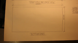
I am going to make it a 1:1 scale display model for this project and using the same material, wood, to construct this display. The bottom part of the display, I will use plastic instead of glass because I want to be save:P The graph below is the plan and scale (CM) for the display.
Try to combine all three pictures together. Sorry for the confusion.
Front and Back
Side X 2
Bottom
INTD 101- Project #4 A Rough Draft (Late Post)
This graph below is the rough draft of my final idea of the display. The top of the display will be a container for paper; middle part will be the storage for Little Black Graphite packages; the bottom part will work like a screen or something to shows different figures of Little Black Graphite.
Sunday, October 10, 2010
INTD 101- Project #4 thinking
The project this time is to make a display for the package that I made before. The material for the display will be wood as well becasue the package is made by wood. The idea is to make the display looks simple and useable. I am still thinking about it and hopefully idea will pop up somethime in my head.
Sunday, October 3, 2010
INTD 101- Project #3 Final Product
This box is made by wood and it is design as a graphite sticks container.
top of the box
bottom of the box
and this is what inside the box
this is the logo and the character, Little Black Graphite
Friday, September 24, 2010
INTD 101- Project #3 Package working in progress
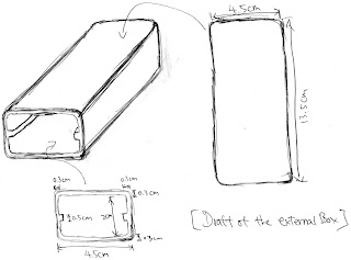
I am going to create a wooden box for graphite sticks. The brand name is going to be 'Liitle Black Grapite'. These couple graph below is my rough idea for the box/container.
this is my very first idea and I think it would be nice to have such shape is contain the graphite stick.
this is my second idea which is more sample and can more graphite sticks as well.
Because of the technical problem, I decided to make the second one.
Two graphs above shows a more detail scale for the graphite container.
Saturday, September 18, 2010
INTD 101- Project #2 BRANDING
A rough draft for the first day.
Then I think it would be to boring if I only show 3D squares and the word 'Graphite' to promote the product.
Later, I came up with an idea, give a graphite a personality.
This is the first draft and I named it 'Small Black Graphite'.
This is the final draft and I think it will be a more appropiate to call it 'Little Black Graphite'.
Later on,I made two different versions of wallpaper.
The second one is my final decision.
This is my final product and the reason is I want to show the contrast between me and the 'Little Black Graphite'. I want to send a message is that graphite is not only a drawing tool but at the time it is also a tool to let people express themselves, graphite can work as a communication tool as well.
INTD 101- Project #1 POSTCARD
I chose pencil as my object to make the postcard. The reason is because I think pencil is the most essential element to a design industry. In this project I took a picture of a pencil and make it into a postcard.
I think it would be nice to present with the word 'Design'.
This is the final product, I stick the photo on a cardboard in order to make it become stable.
Subscribe to:
Posts (Atom)


.JPG)


